Tag Archives: Color scheme

Paramount Hotels & Resorts launches DAMAC Towers in Dubai

Five-star hotel launches can quite often be looked over in Dubai, but when Paramount Pictures puts its name to something we pay attention, interested in understanding how a major Hollywood film studio is going to approach the design of such a project.

Joining forces with DAMAC properties, who have produced residences by Versace Home and FENDI CASA, Paramount Hotels & Resorts announced the major joint development to be called DAMAC Towers by Paramount. The project, which houses four towers located in Downtown Dubai, will be home to the first ever Paramount Hotel and Paramount Residences. The project is due for completion and opening in 2016.
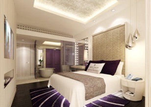
And yet, what is going to be different about this development? When a luxury fashion brand puts its name to a property – be it residences by Versace Home, FENDI CASA or Baccarat, a hotel by Armani, or a nightclub by Armani or Cavalli – you pretty much know what you’re going to get. It’ll be luxurious and impeccably designed, but it’ll reflect the fashion brand so closely that from a design perspective there aren’t going to be any surprises. This isn’t to say the above mentioned interiors aren’t amazing, they are! The Armani Hotel’s sleek black and grey minimalist interior exudes class and luxurious simplicity, and only a genius (we’re talking Roberto Cavalli here) could combine zebra print, purple lighting, black crushed velvet with enormous chandeliers all in one space, and still keep it sophisticated. It’s just that, as the properties are an extension of what is already a design brand, you know they are going to be, well, an interior version of a couture dress.
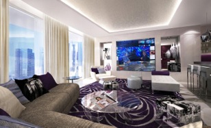
But how does one of the oldest, most recognized Hollywood film studios decide to design its hotels? We spoke to Thomas Van Vliet, CEO of Paramount Hotels & Resorts, back in December 2012, and he explained that he didn’t want the design to be obvious or tacky by including features such as a ‘Marlon Brando’ Cigar Lounge, and we agree. It was refreshing to hear a brand developing a hotel in Dubai and still wanting to maintain an element of innovation and creativity.

And at the launch we weren’t disappointed. The brand values – creativity, simplicity, collaboration, mystery and escape – show that Paramount Hotels & Resorts will be developed using the same creative process perfected by Paramount Pictures itself. The promise was to focus on innovative design and energizing concepts using the development to showcase media, music, design, fashion and the arts, “For the creative. By the creative.”

The designs were elegant and playful, hinting at the California lifestyle, with a definite yet subtle Hollywood film influence – floor lamps resembling studio lights, a dramatic installation made from light umbrellas. The lobby boasts theatrical high ceilings and celluloid themed structures and curves. The design concept is neither so obscure that film buffs will be disappointed or so apparent that design enthusiasts will cringe – and considering where our passions lie, all we can say is roll on 2016.

DIFF 2012 VIP Lounge The Story: Part I

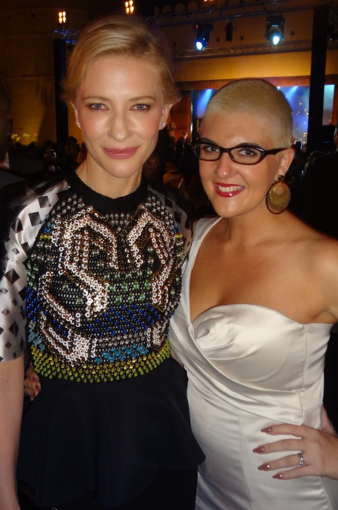
Cate Blanchett & Yasemin Richie at the IWC Gala Party in Dubai: Cate loved her Storyline inspired by Elizabeth: The Golden Age

Since Yasemin Richie are sponsors of the DIFF VIP lounge we thought we’d give you the low-down through out the week.

VIPs to the lounge on the first day were the stars of the opening night red carpet film “The Life of Pi”.  Suraj Sharma, Adil Hussein and Shravanthi Sainath all left with personalised Storylines – Suraj took a Storyline inspired by The Bicycle Thief, a film given to him by Ang Lee while he was perparing for his role in The Life of Pi.

On Monday Best Actress Academy award winner Cate Blanchett made a whirlwind visit, which was tightly scheduled and carefully planned, and loved her Elizabeth: The Golden Age Storyline. Also we had singer/songwriter Bryan Ferry who popped in before heading off to the IWC Gala where he was Master of Ceremony and Cirque de Soleil star Erica Linz – Bryan left with a Storyline inspired by Legend. Throughout the day the Lounge was filled with Kuwaiti television stars.  Leading ladies Shaima Ali and Fatima Al Saffi came in along with brothers Mahmoud and Abdul Bouchari and actor Hamid Al Omani.

Although he didn’t manage to get to the lounge, we had a lovely time with Kevin Spacey at the IWC Gala and he left Dubai with his very own Storyline inspired by American Beauty.

Kevin Spacey IWC Gala Yasemin Richie

Kevin Spacey at the IWC Gala in Dubai: Kevin has a Storyline inspired by American Beauty


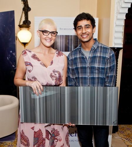
Suraj Sharma & Yasemin Richie

Suraj Sharma & Yasemin Richie with a Storyline inspired by The Bicycle Thief


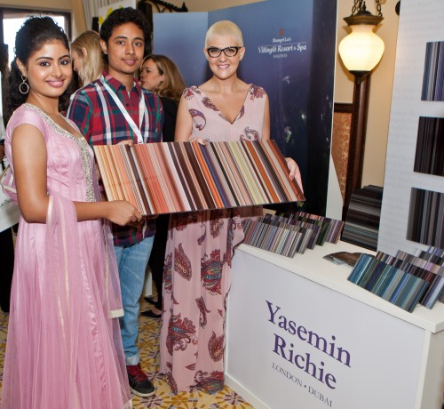
Shravanthi Sainath & Yasemin Richie

Shravanthi Sainath & Yasemin Richie: Storyline inspired by the Bollywood film Straight from the Heart


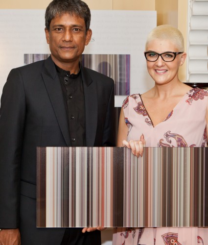
Adil Hussein & Yasemin Richie

Adil Hussein & Yasemin Richie with a Storyline inspired by his film Ishqiya


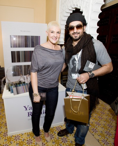
Mahmoud Bouchari & Yasemin Richie

Mahmoud Bouchari & Yasemin Richie


Ahmed Bouchari & Yasemin Richie

Ahmed Bouchari loved the Storyline inspired by The Matrix


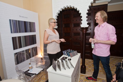
Andrew Adamson & Yasemin Richie

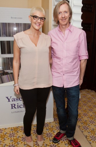
Had a great chat with Andrew Adamson, director of Shrek, about how the colour palette of a film is created


Andrew Adamson & Yasemin Richie

Andrew Adamson & Yasemin Richie


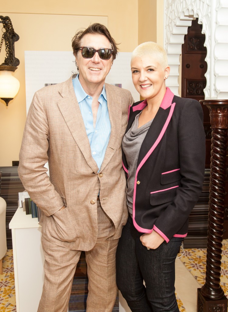
Bryan Ferry & Yasemin Richie

Bryan Ferry &Yasemin Richie


Yasemin & Richie Delaroche

Yasemin & Richie Delaroche at the IWC Gala during DIFF 2012

Interior Style Trend: Monochromatic Colour Scheme

A look that is in all the interior design magazines at the moment is the monochromatic colour scheme and, don’t worry, it’s not as scary as it sounds. A monochromatic colour scheme simply uses variations in shade of a single colour to create a clean and elegant look.

Monochromatic colours go well together, producing a soothing effect, which is fantastic to come home to after a stressful day. The monochromatic scheme is very easy on the eyes, especially with blue or green hues and can be used to establish an overall mood. The main colour can be integrated with neutral colours such as black, white, or grey. One thing to be aware of is that it can be difficult when using this scheme to highlight the most important elements of your room. The space can also end up looking a bit boring and bland if you haven’t planned it properly.

So how do you do it? Firstly you have to choose your main colour. Personally I like beige for this colour scheme, but blues and greens also work well. Choose a soothing soft shade of your main colour and use this throughout, for example on the walls. If you are going to paint all the walls of a room with colour be careful to choose a light shade to avoid overkill, and to make sure you don’t close in the space by making it too dark. With this as your base colour, choose furniture in different shades. For example, if you have a beige colour scheme the obvious choice would be wooden furniture.

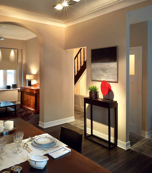
Monochromatic Colour Scheme

Small colour accents will add interest to the scheme

If you are using a blue, white or grey furniture would work well. Always remember neutrals – black, white, or grey – can be added to the main colour. Once you have your base you have to choose textiles, and additional items to finish the space that are different shades of the main colour. Make sure not to make everything ‘match’ – that is not the aim of this look – you want to use as many shades of the main colour as possible

Again, if you are using beige, the colours in your room can range from a dark brown to an almost off-white beige, in addition to neutral colours. An easy way of doing this is to get a few paint colour charts from a local hardware store and carry these with you when you’re shopping for items. To add interest to the space, you can add one or two pieces of a contrasting colour, but do this cautiously as you don’t want to ruin the overall scheme.

And that’s it! Remember to have fun with it, and make sure you always keep the overall mood in mind when choosing different colours/pieces for your room.